

In a world conditioned by visual excess, a surprising shift is taking place, not in what we design, but in how we experience it. Homes are becoming softer. Not just in texture or tone, but in spirit. This is the new language of luxury, quiet, grounded, and emotionally intelligent.
Understated elegance is no longer an aesthetic fringe. It has become a statement in its own right. The kind that whispers rather than shouts, where depth matters more than drama. And it’s emerging everywhere from Dubai lofts to Riyadh townhouses to coastal escapes in Oman and Sharjah. A global shift, filtered through a regional lens.
The Age of Emotional Interiors
We’ve lived through an era of hyper-curation: gallery walls, saturated palettes, design ‘moments’ engineered for the grid. But fatigue has set in. The most considered homes today aren’t necessarily the most photogenic, they’re the most felt. Think spaces that exhale. Rooms that welcome stillness. Homes that hold you rather than perform for you.
Designers are increasingly turning inward, focusing not just on how a room looks, but what it does to the nervous system. How light moves across a plaster wall. The acoustics of a thick wool rug underfoot. The meditative rhythm of a hand-thrown bowl or a door that closes with intention. Beauty, now, is measured in nuance.
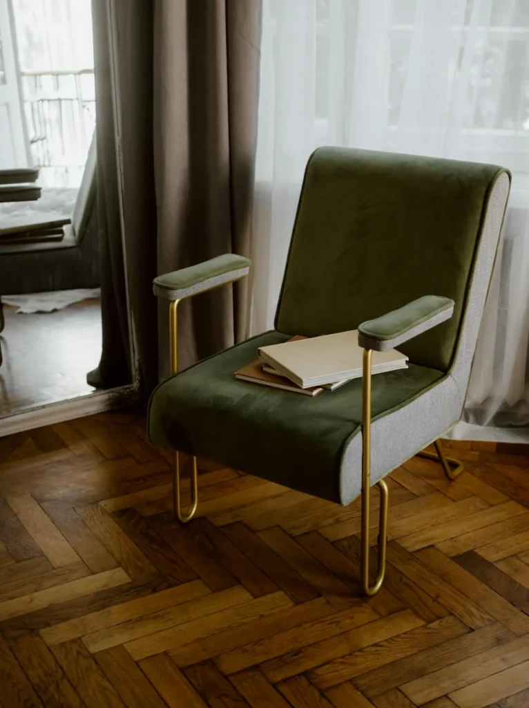
A Material World
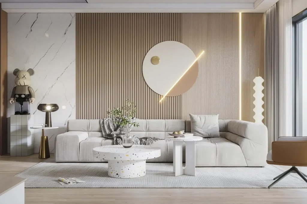
Texture is leading the charge. In place of gloss and perfection, there’s a return to honest, tactile materials: brushed oak, travertine, raw cotton, lime paint, unlacquered brass that tells a story as it patinas over time. These are elements that age with you, quietly, gracefully.
Even colour has been recalibrated. Earth tones have matured beyond trend into timelessness: sand, clay, stone, bone. In the region, this palette speaks not only to nature but to heritage, echoing desert terrain, coral stone courtyards, and the quiet dignity of traditional majlis spaces.
Heritage Reimagined
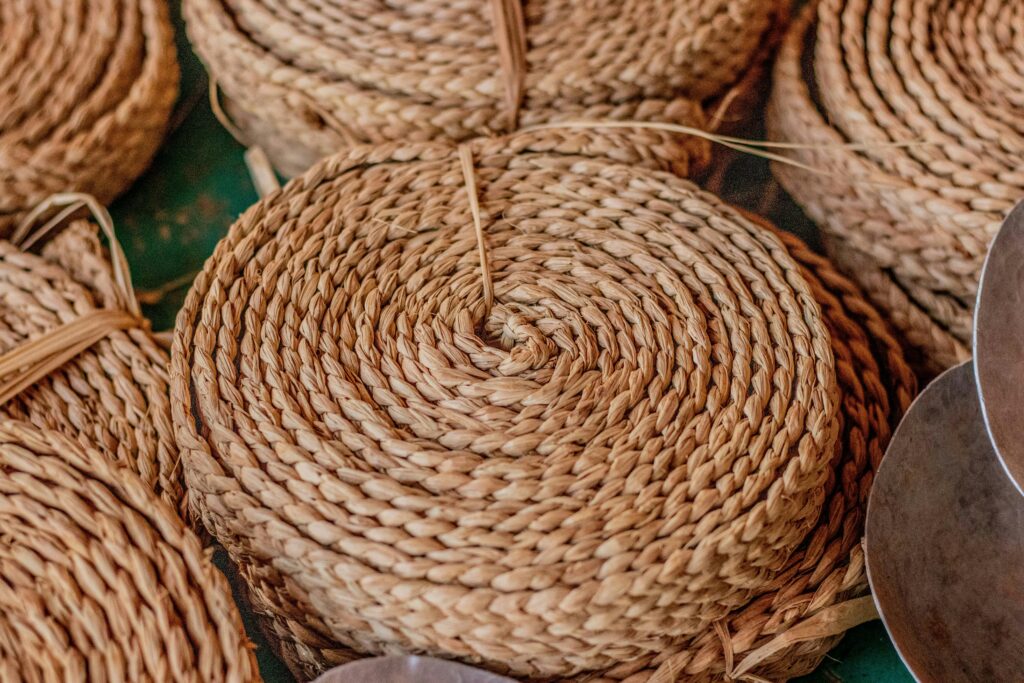
One of the most interesting expressions of quiet luxury in the Middle East is how it intersects with craft and cultural memory. Rather than relying on international brand names, homeowners are sourcing from local artisans, repurposing heirlooms, and commissioning custom pieces that carry personal or regional significance.
Woven khous mats, gypsum latticework, and carved teak panels are being reinterpreted in modern contexts, not as nostalgia, but as design DNA. This is luxury with roots.
Designing for Depth, Not Drama
Ultimately, the move toward understated elegance isn’t about minimalism. It’s about meaning. It reflects a wider lifestyle shift: slowness over spectacle, permanence over performance. And it marks a maturing of design culture in the region, one that no longer needs to prove itself through opulence.
In an era of noise, the real luxury is discretion. A home that feels like a sanctuary. A space that prioritises mood over metrics. Rooms that aren’t just seen, they’re sensed.
Because true elegance doesn’t compete. It endures.
The Mood of Mocha Mousse
Pantone’s Colour of the Year 2025 embraces warmth, earthiness, and the quiet confidence at the heart of refined interiors.
Meet Mocha Mousse – a nuanced brown with soft, cocoa undertones and a velvet-like depth. It’s not just a colour; it’s a lifestyle choice. Rich yet restrained, Mocha Mousse moves away from cooler greys and overly crisp whites, instead inviting warmth and timeless sophistication into the home.
Why It Works for Quiet Luxury:
1. It grounds without overwhelming
Mocha Mousse creates visual weight without harshness. It’s the perfect alternative to black or charcoal in spaces designed to soothe rather than startle.
2. It plays well with texture
From suede and velvet to brushed oak or microcement, this tone enhances surface richness — crucial to the quiet luxury palette.
3. It pairs elegantly with regional tones
Think coral stone, terracotta, sand, or aged brass — Mocha Mousse brings cohesion to desert-inspired interiors across the Middle East and beyond.
4. It invites slowness
There’s a meditative quality to this colour. It’s the shade of cacao, aged leather, warm wood, and shadows at dusk. It’s a cue to linger, pause, and breathe.
5. It’s endlessly layerable
Use it as a wall colour, upholstery base, curtain fabric, or accent tone. Pair with taupe, bone, sage, or even a soft lavender-grey for a deeper, more dimensional palette.
Editor’s Tip:
Want to introduce Mocha Mousse into your space without repainting? Start small: a cashmere throw, a linen lampshade, a ceramic coffee set in the shade. Texture is where this colour sings.